
🍰A Slice of Forever — Wedding Scrapbook Layout Idea for Cake-Cutting Moments 🍰💛✨
- This Chick Loves Paper

- Mar 1
- 13 min read
The Sweetest Kind of Chaos, Cupcakes, Metallica & a Wedding Scrapbook Layout Worth Swooning Over

When I tell you this wedding scrapbook layout took me on a whole sweet, sassy ride, friend… whew. If you were here last week for Page One of this album, then you already know we’re deep inside the most sentimental surprise EVER — a full wedding scrapbook created by the groom as a gift to his bride. Yes. A man said, “Let me make an album.” And yes, my heart is still melting like buttercream in July. 🥹💛
But what makes this series feel so alive isn’t just the photos — it’s this couple’s entire vibe. The bride’s purple hair. The black accents in her gown. Their wedding song? METALLICA. I mean, come on… that’s the kind of unexpected magic that makes documenting their day feel like crafting a rom-com where the soundtrack headbangs. And yet — here we are using Nature’s Walk DSP, which has absolutely nothing “wedding” about it on the surface… and somehow it works so beautifully that people keep messaging me saying, “WHY does this work? HOW does this work?!” Girl, same. 😂

But that’s exactly why today’s layout is so fun. We’re capturing one of the most iconic wedding moments: the cake cutting — the giggling, the emotional chaos, the teasing, the “don’t ruin my makeup OR the photos” moment every bride whispers in her soul. These photos don’t need diamonds or lace paper to feel elegant; they need storytelling, texture, and intentional design. Which means we are about to layer, flip, mat, die-cut, ink, and sparkle our way through a page that feels sweet, modern, and absolutely true to their vibe.
So grab your trimmer, your drink of choice, maybe a cupcake (for research purposes, obviously 🍰😂), and let’s craft this wedding scrapbook layout one delicious layer at a time.
✨ Materials Used to Create This Wedding Scrapbook Layout
🖨️ Patterned, Vellum & Specialty Papers


• Stampin’ Up!® Vellum 12x12 Specialty Paper– translucent strip beneath the photo cluster to lighten the page
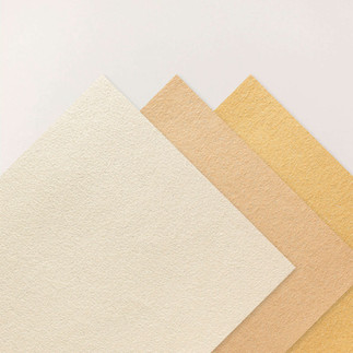
• Stampin’ Up!® Nature’s Walk 12×12 DSP – main patterned paper for both pages
• Stampin’ Up!® Natural Hues 12×12 Textured Specialty Paper – layered under DSP for added depth and softness
🪵 Cardstock

• Stampin’ Up!® White Willow 12×12 Cardstock — layout base.
• Stampin’ Up!® Basic White 12×12 Cardstock
– photo mats
– flower die cuts
– poinsettia petal sprigs
• Stampin’ Up!® Early Espresso 12x12 Two-Tone Cardstock
– base for the title
– photo mat layers
• Stampin’ Up!® Mossy Meadow 12x12 Two-Tone Cardstock
– foliage & leaf die cuts
Inks
• Stampin’ Up!® Early Espresso Classic Stampin' Pad
Stamps & Dies


• Close To My Heart® Secret Garden Dies– floral (originally sold by Stampin’ Up!®)
• Stampin’ Up!® Poinsettia Petals Sprigs Dies – soft greenery + filler accent
• Stampin’ Up!® Cake Celebrations Dies — for the cake embellishment.
🛠️ Tools & Embellishments

• Stampin’ Cut & Emboss Machine —floral piece, sprig, and leaf used in the bouquet clusters.
• Stampin’ Up!® Paper Trimmer — used for every straight cut on the layout: DSP panels, photo mats, vellum strips, and those long horizontal bands.
• Stampin’ Up!® Antique Pearls — the perfect tiny accents for flower centers and the poinsettia sprigs.
• Stampin’ Up!® Sponge Daubers - inking edges.
Cricut® Essentials
*As an Amazon Associate, I earn from qualifying purchases.


• Cricut® Maker 3 — my primary cutting machine for titles, SVGs & embellishments
• Cricut® StandardGrip 12×12 Mat — 3 count used for cardstock, photo paper & labels
Embellishment & Photo Papers
• Canon Photo Paper Plus Glossy II (4×6, PP-301) → For 4x6 or smaller - printed photos
• Canon Matte Photo Paper (MP-101, 8.5×11) → Used for Cricut print-then-cut elements & titles
• Canon Double-Sided Matte Photo Paper (MP-101D, 8.5×11) → Also used exclusively for Cricut embellishments, icons, & layered pieces

Printers - Embellishment & Photo
As an Amazon Associate, I earn from qualifying purchases.
• Canon TS9521C Crafting Printer — used for printed journaling pieces, print-then-cut embellishments & titles
• Epson PictureMate PM-400 Wireless Compact Color Photo Printer, white — compact wireless printer makes it easy to print beautiful 4" X 6" And 5" X 7" Photos that will last
printer ink refills
⭐ BUILDING THE PAGE — One Slice, One Layer, One Laugh at a Time 🍰

Before we get into the nitty-gritty, here’s the heart behind the choices:
This layout isn’t just about arranging photos. It’s about telling the story of the moment — the slice, the feed, the shared grin, the love that radiates through frosting-covered fingers and laughter. And every mat, every cluster, every flipped DSP panel supports that moment and guides your eye through it.
Let’s build, friend. 💛✨
🍰 STEP 1 — Build the Base & Lay Down Your DSP Panels


Start with two sheets of 12×12 White Willow cardstock. We use these as our base because the Nature’s Walk DSP for this layout is double-sided — script on one side and gingham on the other — and the only way to feature both patterns exactly where we want them is to cut each strip, flip the leftover, and adhere them to a solid foundation.

For the left page, cut your DSP like this:
• Cut a 7 × 12 strip from the script side.
The leftover piece from that sheet will automatically be a 5 × 12 gingham strip when you flip it over.
For the right page, reverse the order:
• Cut a 5 × 12 strip from the script side.
The leftover becomes a 7 × 12 gingham strip when flipped.
Now adhere all four strips across your two bases in this order:
7” script → 5” gingham → 7” gingham → 5” script
This creates a perfectly balanced flow from left to right and uses the double-sided DSP exactly as intended.
✨ Quick Design Tip: When cutting your script panels, make sure the text reads in the correct direction so you don’t accidentally glue upside-down wording onto your layout.
✨ PRO TIP: Once the DSP strips are adhered, lightly ink the exposed top, bottom, and outer edges using Early Espresso. To ink edges, gently sweep a sponge dauber along the paper’s edge — this adds depth without overpowering the design.
🍰 STEP 2 — Add the Natural Hues & Vellum Banner Strips

Cut four 12” × 3” strips — two from Natural Hues and two from vellum. Use an octagon die to create the ducktails at the ends. When cutting the vellum, place the die slightly higher so the vellum tails finish about ¼” shorter than the Natural Hues pieces.
Ink the edges of the Natural Hues banners with Early Espresso for definition. For the vellum, ink the full edge on the left banner, but only ink the ducktail end on the right banner, so the ink doesn’t show underneath your journaling later.

Layer each vellum strip directly on top of its matching Natural Hues strip, then place them on your pages exactly as shown in the process photo — these banners anchor the whole title area and help break up the vertical space of the layout.
⭐ PRO TIP: When attaching vellum, always hide your adhesive under cardstock, embellishments, or the layered strip. Vellum will show any glue that isn’t tucked out of sight.
🍰 STEP 3 — Cut & Prep All Photo Mats

For this layout, every photo is double-matted using Early Espresso and Basic White. I designed it with weddings in mind — big, emotional focal photos plus enough supporting spaces to actually tell the whole story. So instead of choosing between one oversized photo or multiple tiny ones (like so many wedding layouts force you to do), this spread gives you both. Here’s the exact cut list so you can follow along without confusion:
Left Page

I wanted the top spot to shine — one big photo if you want the drama, or two smaller ones if you want the story split (like I did here). The measurements below follow the two-photo design.
Top photo panel (split into two photos):
Cut one Early Espresso mat: 8½” × 5½”
Cut one Basic White mat: 8¼” × 5¼”
Cut your photo into two pieces: 4” × 5” each
Two square photos beneath:
Cut two Early Espresso mats: 4” × 4”
Cut two Basic White mats: 3¾” × 3¾”
Photos: 3½” × 3½” each
Right Page

Hero photo:
Cut one Early Espresso mat: 7½” × 7½”
Cut one Basic White mat: 7¼” × 7¼”
Photo: 7” × 7”
Supporting square photo:
Early Espresso mat: 4” × 4”
Basic White mat: 3¾” × 3¾”
Photo: 3½” × 3½”
Overlapping 3×4 photo:
Early Espresso mat: 3½” × 4½”
Basic White mat: 3¼” × 3¾”
Photo: 3” × 4”
The mix of large and small mats helps tell the story — bigger photos carry the emotion, smaller ones fill in the details.
🍰 STEP 4 — Arrange Your Photos to Tell the Story

I always start by choosing my hero photo — the image that best represents the heart of the layout. For this page, the cake slice instantly won that spot. Not only does it tie perfectly into the title A Slice of Forever, but placing it in the center pulls the warm banner colors inward, giving the layout a strong focal point.
Once that anchor was in place, I started positioning the remaining photos to create balance across both pages. The cake-cutting and cake-feeding shots stayed together on the left page since they flow naturally as a pair and both feature the groom’s black tux.

To keep that deeper color from weighing down one side of the layout, I balanced it by placing a smaller tux photo in the opposite corner on the right page.
I used the same approach with the cake-topper images: the sliced cake became my hero photo, while the unsliced cake-topper photo moved to the left page in a smaller size.
Spreading those visual elements across both pages keeps the layout feeling connected without repeating the same moment twice.
🍰 STEP 5 — Prepare & Place All Embellishments (Florals, Sprigs, Cake & Clusters!)

I began by die-cutting all of my florals using the CTMH Secret Garden Dies and the Poinsettia Petals sprigs. For each flower, I added Antique Pearls in groups of three to the centers — and even though they’re adhesive-backed, I glued them with Barely Art Precision Glue to make sure they stay put inside the album.
Then I die-cut my leaves from both Mossy Meadow cardstock and vellum, giving each cluster a soft layered effect that complements the wedding theme.

Once everything was prepped, I started building my clusters around the page.
Instead of a traditional visual triangle, this layout uses five clusters — three on the left page and two on the right. This creates a natural flow that guides your eye through the entire spread without feeling heavy or overly symmetrical.
One of my favorite surprises was realizing that by adding a tiny cluster under the hero photo, this design could instantly split into two standalone single-page layouts while remaining cohesive as a double-page spread.

When I reached the cluster beside the large 8½” × 5½” photo on the left, I knew it needed more height.
Instead of stacking extra florals, I used the cake die-cut from the Cake Celebrations Dies. It added the perfect vertical lift and tied the theme together in the sweetest way — literally.
After that, I placed the remaining clusters just like you see in the final layout photo, tucking sprigs, layering leaves, and letting the embellishments frame the photos without overwhelming them.
🍰 STEP 6 — Create & Place Your Title + Subtitle

I designed my title in Design Space® and cut each word four times from Natural Hues Textured Specialty Paper.
Then, using my Bearly Art Precision Glue (my go-to for delicate work), I stacked the layers to create that thick, chipboard-style dimension I love — no foam tape needed.
Once the words were built & dried, I adhered them to an Early Espresso outline, which gives the whole title a clean, bold frame that stands out beautifully against the patterned paper.

To tie both pages together, I also created a small subtitle — “Love Is Sweet” — using the same colors and stacked-layer method. This little banner helps form a visual connection between the title on the right and the rest of the layout on the left, creating a soft visual triangle with the journaling.
⭐ PRO TIP: Stacking identical die cuts gives you gorgeous depth without bulky layers in your album — and choosing a darker outline like Early Espresso keeps your title crisp and readable on busy patterned paper.
🍰 STEP 7 — Add the Journaling (Final Step!)

For this layout, I printed my journaling onto Avery clear labels using a clean, elegant font.
Clear labels are one of my favorite tricks for wedding layouts because they blend seamlessly into the page — it looks like the words were printed directly onto the cardstock, but without the stress of stamping or committing to handwriting on the first try.
*As an Amazon Associate, I earn from qualifying purchases.

I placed the journaling beneath the large 7” × 7” hero photo, letting it anchor the story without competing with the embellishments.
There’s always a time and place for handwritten journaling, but for pages that feel formal or refined, I prefer typed text.
It keeps everything looking polished and intentional while still allowing the photos and embellishments to shine. If you have a long story to tell or want a crisp, clean finish, typed journaling is a beautiful option — especially on layouts like this one.
✨ A Layout as Sweet as the Moment It Captures

And just like that, friend… our cake-cutting layout is complete — layered, balanced, and full of the laughter and sweetness that made this moment unforgettable. I love how the combination of big photos + tiny details brings the whole story to life, especially with the shine of that little photo-paper cake stand and the pearl-tipped sprigs adding just the right touch of elegance.
What surprised me most was how beautifully this Nature’s Walk DSP handled indoor reception photos. Who knew it would be this versatile? From outdoor portraits to cupcake-tower chaos, it blends right in and elevates the moment instead of fighting it. And honestly, this design would work for any celebration — birthdays, anniversaries, milestones… anything with joy (and frosting).
But for today, we captured one perfect slice of their love story — and didn’t it turn out gorgeous?
⭐ Ready for More Scrapbooking Adventures? Let’s Rock n Roll 🤘✨
This is only the second layout in this wedding series, and we haven’t even touched the outdoor portraits, family groupings, detail shots, or reception memories still waiting in the wings.
Explore more layouts on the blog — Disney, theme parks, school moments, everyday chaos, all the magic — and let inspiration spark your next masterpiece.


✨ Share Your Creations — Show Me Your Sweetest Moments! 🍰🤘
Did you know we have our very own Members’ Gallery, friend? It’s the happiest little corner of the internet where YOUR creativity shines — and trust me, the gallery is missing your magic.

So tell me… do you have a wedding scrapbook layout you’re proud of? Have you used Nature’s Walk DSP in a totally unexpected way? Or are you planning to recreate this cake-cutting design with your own twist?
This is your moment to inspire someone else’s next layout. Click the button below, upload your photos, and let the community swoon over your gorgeous work.
💛✨ Let’s inspire each other one sweet slice at a time. 🍰✨
✨ One Last Bite of This Love Story

And that, my friend, is how you take a cake-cutting moment and turn it into a whole scrapbook snack. This page has drama, sweetness, dimension, sparkle, and just enough “don’t-you-dare-smear-that-frosting-on-my-dress” energy to keep things interesting. If this layout doesn’t make you want to grab your trimmer and dive headfirst into your own wedding photos — I don’t know what will.
So here’s to more stories, more pages, more laughs, and way more sparkle as we keep building this wedding series together. We’re only two layouts in, and already the album is giving main-character energy… so buckle up, buttercup — the next one is about to be chef’s kiss.
Until next time… May your treats be sweet, your layers be perfect, and your glitter never fall into the frosting. 🍰✨
April — This Chick Loves Paper
🛒 Grab Your Supplies & Get Crafting!

All photos and projects are subject to copyright © ThisChickLovesPaper.com.
Images © Stampin’ Up!® & CTMH®.
The content in this blog is the sole responsibility of April Raine – This Chick Loves Paper, Independent Stampin’ Up!® Demonstrator.
The use of and content of classes, services, or products offered is not endorsed by Stampin’ Up!®.
Create a gorgeous 12×12 wedding scrapbook layout featuring a six-photo, double-page cake-cutting design using Nature’s Walk DSP and Cake Celebrations Dies. This step-by-step tutorial shows you how to build mats, banners, clusters, titles, and journaling for an elegant wedding layout. Created by This Chick Loves Paper.

⭐How I Protect My DSP, Cardstock & Finished Cards
*As an Amazon Associate, I earn from qualifying purchases.
I store my DSP, cardstock, scraps, and even finished cards in these clear resealable bags.
The 2-mil thickness is perfect for everyday crafting (they make a 4-mil option if you want extra durability!), and they’re tough, reusable, and great for keeping your entire crafting stash clean, tidy, and protected from the chaos of the craft room.
• 13×13 Plymor 2mil Zipper Reclosable Bags — for 12×12 DSP, cardstock sheets & scraps
• 9×12 Plymor 2mil Zipper Reclosable Bags — for 8.5×11 cardstock & scraps
• 6x8 Plymor 4mil Heavy Duty Reclosable Bags — for storing extra die cut embellishments & finished cards, card workshop kits

🧰 Other Tools & Adhesives I Use
*As an Amazon Associate, I earn from qualifying purchases.
• Bearly Art Precision Glue — my go-to for delicate work like stacking die-cut letters.
• Tombow Air Touch Adhesive + Liquid Glue — strong, smooth hold for the larger and heavier embellishments.


Comments