
Outdoor Wedding Scrapbook Layout Using Nature’s Walk DSP | Jayma Malme & Friends Collab (CDT Sketchbook V5 – Page 6)
- This Chick Loves Paper

- Feb 22
- 14 min read
Updated: Mar 1
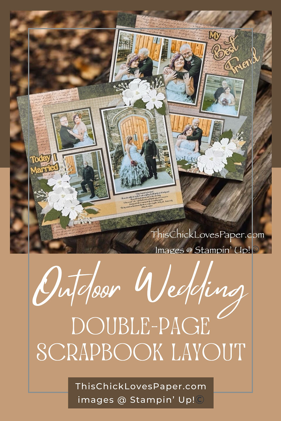
A Wedding Layout With Unexpected Vibes

When I tell you I had been WAITING for the right paper for these wedding photos… girl. MONTHS. The kind of months where you pull out every DSP you own, squint at it, hold it against the photos, and say, “Nope, too floral… too frilly… too loud… too pink… too not-them.” These photos deserved a paper that actually matched their vibe — and apparently, that paper needed time to find me.
Then Nature’s Walk DSP showed up like, “Move aside, I’ve got this.”
Soft neutrals. Botanical texture. That espresso script that practically winks at you from across the craft table. Definitely not your textbook “wedding” DSP… but let’s be honest: when the couple dances to Metallica, your paper choice is already allowed to break the rules. 😂
So I trusted the vibe.
I trusted the paper.
I trusted the sketch.
(And tried not to throw my Cricut during the process, but that’s another story.)
Somewhere between the vellum layers, the pearl-tipped florals, the espresso mats, and three deep breaths during a letter-cutting crisis, this layout turned into something I genuinely adore. It feels earthy, romantic, bold, sentimental… and honestly? Perfect for them.
So grab your scissors, warm up that tape runner, and let’s craft a layout that makes your glitter whisper, “OH honey… she came to SLAY today.” ✂️✨
MATERIALS — What I Used for This Wedding Scrapbook Layout
✂️ Designer Series Paper


• Stampin’ Up!® Nature’s Walk 12×12 DSP – main patterned paper for both pages
• Stampin’ Up!® Natural Hues 12×12 Textured Specialty Paper – layered under DSP for added depth and softness
• Stampin’ Up!® Vellum 12x12 Specialty Paper– translucent strip beneath the photo cluster to lighten the page

🪵 Cardstock
• Stampin’ Up!® Basic White 12×12 Cardstock
– photo mats
– flower die cuts
– poinsettia petal sprigs
• Stampin’ Up!® Early Espresso 12x12 Two-Tone Cardstock
– backing behind the DSP strips
– base for the title
– photo mat layers
• Stampin’ Up!® Mossy Meadow 12x12 Two-Tone Cardstock
– foliage & leaf die cuts
Inks
• Stampin’ Up!® Early Espresso Classic Stampin' Pad
🌸 Stamp & Thin Cuts


• Close To My Heart® Secret Garden Dies– floral (originally sold by Stampin’ Up!®)
• Stampin’ Up!® Poinsettia Petals Sprigs Dies – soft greenery + filler accents
🛠️ Tools & Embellishments

• Stampin’ Cut & Emboss Machine —floral piece, sprig, and leaf used in the bouquet clusters.
• Stampin’ Up!® Paper Trimmer — used for every straight cut on the layout: DSP panels, photo mats, vellum strips, and those long horizontal bands.
• Stampin’ Up!® Antique Pearls — the perfect tiny accents for flower centers and the poinsettia sprigs.
• Stampin’ Up!® Sponge Daubers - inking edges.
🧰 Other Tools & Adhesives
*As an Amazon Associate, I earn from qualifying purchases.

• Bearly Art Precision Glue — my go-to for delicate work like stacking die-cut letters.
• Tombow Air Touch Adhesive + Liquid Glue — strong, smooth hold for the larger and heavier embellishments.
• Foam Tape — used only where I wanted soft elevation
• Cricut Maker — the machine behind the layered script title. It needed offsets, patience, and maybe one dramatic sigh… but she delivered.
Cricut® Essentials
*As an Amazon Associate, I earn from qualifying purchases.


• Cricut® Maker 3 — my primary cutting machine for titles, SVGs & embellishments
• Cricut® StandardGrip 12×12 Mat — 3 count used for cardstock, photo paper & labels
Embellishment & Photo Papers
• Canon Photo Paper Plus Glossy II (4×6, PP-301) → For 4x6 or smaller - printed photos
• Canon Matte Photo Paper (MP-101, 8.5×11) → Used for Cricut print-then-cut elements & titles
• Canon Double-Sided Matte Photo Paper (MP-101D, 8.5×11) → Also used exclusively for Cricut embellishments, icons, & layered pieces

Printers - Embellishment & Photo
• Canon TS9521C Crafting Printer — used for printed journaling pieces, print-then-cut embellishments & titles
• Epson PictureMate PM-400 Wireless Compact Color Photo Printer, white — compact wireless printer makes it easy to print beautiful 4" X 6" And 5" X 7" Photos that will last
printer ink refills
💍✨ HOW THIS WEDDING SCRAPBOOK LAYOUT CAME TOGETHER WITH NATURE’S WALK DSP
If you’re new here, I normally walk you through every layout with full measurements, cuts, and all the nerdy details your trimmer dreams about. But because this project uses Page 6 of the Creative Design Team Sketchbook Volume 5, those measurements belong to the designers — so out of respect for their work, I’m not sharing the exact cuts in this post.
Buuuut don’t worry — I am sharing the heart of the process: what I changed, why I changed it, and how the sketch transformed into this moody, romantic wedding layout. Think of this as the behind-the-scenes tour… without spoiling the purchase-worthy goodies inside the sketchbook.
STEP 1 — Laying the Foundation & Making the Sketch Your Own

The CDT Sketchbook Page 6 starts with a large vertical panel on the right page — nothing fancy, just a shaded block letting you know, “Hey, something goes here.” Sketches don’t dictate paper, mood, or style; they simply give you the bones.
So when I pulled out the Nature’s Walk DSP, that handwritten script pattern practically flirted with me. It felt soft, romantic, outdoorsy, and absolutely perfect for this wedding story — so onto the right page it went.

But here’s where I stopped playing by the sketch’s rules and started playing by mine:
I added a second matching script strip on the left page to balance everything out and frame those distressed green center panels.
That tiny creative pivot made the entire two-page spread feel coordinated, intentional, and elevated — still true to the sketch, but now with its own personality. This is the magic of adapting a sketch: one small choice can shift the whole layout from “nice” to “ohhhh okay I see you.”
Before adhering anything, I inked just the vertical edges of both script pieces with Early Espresso Classic Ink. Leaving the top and bottom edges clean kept the look light and airy, while the softly shaded sides added just enough warmth to suit the rustic outdoor wedding vibe. It’s subtle… but it makes the whole foundation feel richer.
PRO TIP: A sketch is a starting point — not a binding contract. If repeating, mirroring, shrinking, stretching, or reinventing a panel makes your layout flow better? Trust your eye and do it. The best pages come from confidence, not compliance.
STEP 2 — Building the Backbone: Vertical Panels + Horizontal Layers

I started by laying down the large center panel on the left page and its coordinating “sister strip” on the right. These two instantly make the whole spread feel connected — like the pages are linking arms and walking down the aisle together. Because this layout leans earthy and romantic, these panels create that soft visual flow that the photos will eventually float on. I inked only the outer edges of each DSP piece with Early Espresso Classic Ink, giving them a warm, natural shadow. I purposely left the inside edges clean so the middle transition feels soft and blended instead of sharp or boxy. It’s a tiny detail, but it completely changes the mood.

Once the vertical pieces were in place, it was time to bring in the long horizontal layers — the ones that pull both pages together like a ribbon across a bouquet. First came the Natural Hues Textured Specialty strip, fully inked in Early Espresso for depth and richness. Then came the vellum banner on top, and THAT was the moment this layout exhaled. The vellum softened the lines, added that dreamy “wedding veil” transparency, and balanced all the earthy tones underneath. These two strips stretch across both pages and act like a visual bridge — suddenly, the whole layout felt cohesive, romantic, and perfectly grounded.
PRO TIP: Strong vertical lines can feel stiff — a long soft horizontal layer relaxes everything and makes your pages flow like butter.
Step 3 — Photo Mats: Where the Sketch Takes a Backseat and Real Life Wins

Ah, the photo mats — the moment where the sketch politely stepped aside and let real life take the wheel.
Every photo is double-matted with Basic White over Early Espresso. The crisp white pulls the images forward, while the espresso adds that warm grounding that connects the photos back to the DSP and the title. Classic, clean, and so elegant for a wedding layout.
But here’s where I stopped following the sketch and started following the story.

The original sketch called for eight separate photo mats… and guess what?
I still included eight photos — I just did it differently! . Instead of using all eight mats, I used seven, because two of my photos worked perfectly side-by-side. I printed them together as a single 7×5 image and treated them like one mat. It fits the sketch footprint and tells a stronger visual story.
This is exactly why sketches are starting points — not contracts. My photos had big emotion and strong energy, so they needed room to breathe. Fewer mats, clearer composition, better story. Win-win-win.
PRO TIP: Never let a sketch boss you around. If your photos want to sit differently, let them. The layout should tell your story — not the one the sketch designer imagined.
Step 4 — Floral Clusters: Because Every Wedding Layout Deserves a Bouquet (or three)

Now for the embellishments — my absolute favorite part and honestly the moment this layout stopped whispering “rustic” and started singing “wedding.”
I dove straight into the CTMH Secret Garden Dies and cut every floral piece from Basic White Cardstock, because even though the Nature’s Walk DSP leans warm and earthy, I wanted those bright, crisp florals to echo her wedding dress. The centers? Three tiny Stampin’ Up!® Antique Pearls grouped together for each bloom, giving just the right amount of sparkle without going full rhinestone runway.

The sprigs tucked behind the flowers are from the Stampin’ Up!® Poinsettia Petals Dies, and let me tell you — those little rounded ends are PERFECT for pearls. I added a pearl to every single one because I wanted that baby’s-breath vibe you see in bridal bouquets. It softens the clusters, adds texture, and makes the whole page feel like it smells faintly of fresh flowers and vows.

And the leaves? Also from Secret Garden, cut in Mossy Meadow Cardstock with a few vellum leaves layered in from Stampin’ Up! to keep everything airy and romantic.
I followed the embellishment placement from the sketch (for once! 😂), but built each cluster to feel like a real bouquet — soft, organic, and overflowing just a little.
Between the crisp whites, the gentle vellum, and those pearl-tipped sprigs, the clusters elevated the entire spread into full “wedding album” territory.
PRO TIP: When your DSP leans warm but your photos (or dress!) lean cool, bring in bright white florals to bridge the gap. It keeps the palette cohesive and instantly adds that wedding-day polish.
STEP 5 — The Title That Almost Made Me Retire From Crafting 😂

This title tried me. I picked a gorgeous script font… and Cricut took one look at my textured paper and said, “LOL, absolutely not.” The strokes were too thin, the fibers grabbed the blade, and the letters tore like they were auditioning for a tragedy—pure chaos.
So I did what any stubborn crafter does: I outsmarted it. I created custom offsets, thickened the font, and kept adjusting until Cricut finally decided to behave.
Then I cut four layers from Natural Hues Textured Paper, stacked them, and glued the whole thing onto a bold Early Espresso outline.

And let me tell you — the result is STUNNING.
Elegant. Dimensional. Smooth.
It looks premade… except YOU know the drama it survived.
And because I didn’t want foam tape puffing everything up, stacking the layers gave me that perfect chipboard height without adding bulk.
PRO TIP: If Cricut keeps shredding your script fonts, add 1–2 offset layers. It saves the cut AND makes the final stack look ridiculously expensive.
STEP 6 — Journaling: The Quiet Storytelling That Makes the Page Personal

I adore handwritten journaling — it’s personal, real, and full of character — but not every layout calls for my usual bubbly script.
This wedding spread needed something softer, more elegant, and more in tune with the emotion of the moment.
Since this album is a gift from the groom to the bride, and the words came directly from him, I wanted the journaling to feel intentional and beautifully understated.

To keep the focus on the photos and honor the tone of the story, I printed the full sentiment as one centered paragraph on a clear Avery label using a delicate script font that echoed the curves of the main title.
When I placed it over the DSP, it melted right into the background—readable, romantic, and subtle—adding the perfect quiet touch without interrupting the flow of the layout.
*As an Amazon Associate, I earn from qualifying purchases.
PRO TIP: Match your journaling style (typed, handwritten, strips, block, hidden journaling, etc.) to the emotion and aesthetic of the page. Wedding layouts, heritage pages, and formal events often shine with softer typed fonts, while playful, everyday memories glow with handwritten notes.
✨ THE LAYOUT THAT BROKE ALL THE RULES… AND STILL LOOKED LIKE A DREAM

Nature’s Walk wasn’t “wedding paper.”
Metallica isn’t a “wedding song.”
But somehow?
Together, they told the most honest, emotional, beautifully unexpected wedding story.
This layout is earthy, elegant, moody, soft, bold, heartfelt, and a little rock-and-roll — just like the couple it celebrates. And that’s why I scrap: because paper becomes magic when it reflects the people we love.
✂️💛 COLLAB SPOTLIGHT — CRAFTY FRIENDS & CDT SKETCHBOOK MAGIC

This layout kicks off a brand-new monthly Collab with my crafty ride-or-dies, and let me tell you — these girls do NOT play when it comes to creativity.
We decided to work our way through the Creative Design Team Sketchbook Volume 5 from the very beginning, starting with Page 6, and watching everyone’s take on the same sketch is honestly half the fun.
One sketch… completely different directions… and a whole lot of “OH MY GOSH I NEVER WOULD’VE THOUGHT OF THAT!” moments.
If you haven’t grabbed your Volume 5 sketchbook yet, consider this your flashing neon sign. It’s packed with inspiration, ridiculously fun to work through with friends, and honestly? It’ll make you feel like your creativity has its own personal hype team.

This crew is crazy talented, a little unhinged (in the best crafty way), and every month feels like opening night for a brand-new gallery show.
And if you want to see how the rest of the girls tackled this same sketch — trust me, you do — you can click below to check out the full Collab lineup. Every project has its own style, its own mood, its own “YESSSSS I need to try that!” moment… and that’s exactly why these Collabs are so addicting.
COME CRAFT WITH US — JOIN THE FUN, THE SPARKLE & THE TEAM MAGIC ✂️✨

If this sketchbook Collab has your creative wheels spinning, then girl… you’d fit right in with my team. We’re fun, we’re supportive, we share ideas like candy, and we hype each other up every single day.
Whether you’re brand new or you’ve got glue in your veins, you’re welcome here — and yes, you even get a discount on your supplies (because saving money = more craft hauls).
If you’ve been craving a crafty crew that inspires you, makes you laugh, and helps you grow? This is your sign. Come join us — we can’t wait to craft with you. 💛
✨ EXPLORE MORE — Your Next Scrapbook Obsession Awaits…
Even though this is my very first wedding scrapbook layout (and trust me, it will not be the last!), there’s already a whole world of inspiration waiting for you on my blog.
From outdoor adventures to Disney magic, from bold themed pages to sweet everyday stories, you’ll find layouts that spark ideas, jumpstart creativity, and make you say, “Ooooh, I want to try that!”
Take a stroll through the galleries, soak up the colors and techniques, borrow anything you love (I fully approve 😘), and let yourself get lost in layouts that celebrate real life in the most beautiful way. Your next favorite idea might be one click away.


SHARE YOUR CREATIONS — SHOW US YOUR “I DO” MAGIC! 💍✨

Have you made a wedding scrapbook layout? Played with Nature’s Walk DSP? Fallen in love with vellum leaves or pearl-tipped sprigs?
Whatever you’re creating — we want to see it!
Share your layout in the Members Gallery and inspire the next crafter who’s wondering if earthy neutrals can make a stunning wedding page. (Spoiler: they absolutely can. 😉)
Your projects spark ideas, your ideas spark more creativity, and before you know it… We’re all crafting something beautiful together.
Upload your masterpiece and let your creativity help someone else say “I do” to a new idea.
✨ FINAL THOUGHTS — Love, Paper, and a Little Bit of Rock-N-Roll

This layout reminded me that scrapbooking isn’t meant to follow rules — it’s meant to follow HEART. This couple’s wedding day wasn’t traditional, so their layout shouldn’t be either. It’s earthy, moody, elegant, bold, soft, sentimental, and a little bit rock-n-roll… exactly like their love story. And honestly? That’s my favorite thing about memory keeping. We get to take paper, ink, texture, and color, and turn them into something that feels like the people we’re documenting. Something honest. Something emotional. Something that lasts.
Thanks for crafting with me today — this layout was such a special one to build, and I’m already excited for the next creative adventure we take together. Until then, keep telling your stories, keep making magic, and keep letting your creativity lead the way…
💛 April — This Chick Loves Paper
🛒 Grab Your Supplies & Get Crafting!
All photos and projects are subject to copyright © ThisChickLovesPaper.com.
Images © Stampin’ Up!® & CTMH®.
The content in this blog is the sole responsibility of April Raine – This Chick Loves Paper, Independent Stampin’ Up!® Demonstrator.
The use of and content of classes, services, or products offered is not endorsed by Stampin’ Up!®.
12x12 double-page wedding scrapbook layout featuring outdoor wedding photos, Nature’s Walk DSP, CTMH florals, layered die cuts, textured mats, and heartfelt journaling — see how this layout came together step-by-step, with creative techniques and design choices explained by This Chick Loves Paper using CDT Sketchbook Volume 5.

⭐How I Protect My DSP, Cardstock & Finished Cards
*As an Amazon Associate, I earn from qualifying purchases.
I store my DSP, cardstock, scraps, and even finished cards in these clear resealable bags.
The 2-mil thickness is perfect for everyday crafting (they make a 4-mil option if you want extra durability!), and they’re tough, reusable, and great for keeping your entire crafting stash clean, tidy, and protected from the chaos of the craft room.
• 13×13 Plymor 2mil Zipper Reclosable Bags — for 12×12 DSP, cardstock sheets & scraps
• 9×12 Plymor 2mil Zipper Reclosable Bags — for 8.5×11 cardstock & scraps
• 6x8 Plymor 4mil Heavy Duty Reclosable Bags — for storing extra die cut embellishments & finished cards, card workshop kits


Comments