
Friends & Family Wedding Scrapbook Layout Using Nature’s Walk DSP | Jayma Malme & Friends Collab (CDT Sketchbook V5 Pg 12)
- This Chick Loves Paper

- Mar 25
- 12 min read
At the end of the day, this layout isn’t just about paper, dies, or even the design itself…
It’s about the people.

Picture this… 💛
You’re standing there on one of the biggest days of your life… heart racing, emotions all over the place… and then you look around.
And there they are.
The people who helped shape your story.
The ones who showed up for you long before this day ever arrived.
The ones laughing, hugging, fixing dresses, straightening ties… and probably keeping things just a little bit wild too. 😉
This layout is all about those people — the friends and family who didn’t just witness the moment… they made it what it was.
And as part of this ongoing wedding album series, I’ve been working with the same collection, the same dies, and many of the same embellishments throughout.
But here’s the magic… ✨
Even with the same papers and repeating elements, this page still tells a completely different story.
Because when you change:
👉 the photos
👉 the placement
👉 and the intention behind the design
You completely change the feeling of the layout.
And this one?
This one is all about being surrounded by love, laughter, and the people who mean everything. 💛
So grab your favorite supplies, clear off a little space on that craft table (or don’t… no judgment here 😂), and let’s create something beautiful together. ✂️✨
Materials Used for This Friends & Family Wedding Scrapbook Layout
Pattern & Specialty Paper


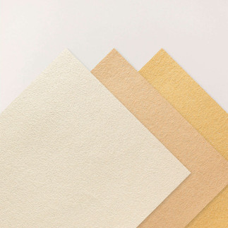
• Stampin’ Up!® Nature’s Walk 12×12 DSP – main patterned paper for both pages
• Stampin’ Up!® Natural Hues 12×12 Textured Specialty Paper – layered under DSP for added depth and softness
• Stampin’ Up!® Vellum 12x12 Specialty Paper– translucent strip beneath the photo cluster to lighten the page
🪵 Cardstock

• Stampin’ Up!® Basic White 12×12 Cardstock
– photo mats
– flower die cuts
– poinsettia petal sprigs
• Stampin’ Up!® Early Espresso 12x12 Two-Tone Cardstock
– backing behind the DSP strips
– base for the title
– photo mat layers
• Stampin’ Up!® Mossy Meadow 12x12 Two-Tone Cardstock
– foliage & leaf die cuts
Inks
• Stampin’ Up!® Early Espresso Classic Stampin' Pad
🌸 Stamp & Thin Cuts


• Close To My Heart® Secret Garden Dies– floral (originally sold by Stampin’ Up!®)
• Stampin’ Up!® Poinsettia Petals Sprigs Dies – soft greenery + filler accents
• Stampin’ Up!® Meant To Bee Bundle – used to create the octagon journaling shape
& to cut the dovetail (ducktail) ends on the horizontal strips
🛠️ Tools & Embellishments

• Stampin’ Cut & Emboss Machine —floral piece, sprig, and leaf used in the bouquet clusters.
• Stampin’ Up!® Paper Trimmer — used for every straight cut on the layout: DSP panels, photo mats, vellum strips, and those long horizontal bands.
• Stampin’ Up!® Antique Pearls — the perfect tiny accents for flower centers and the poinsettia sprigs.
• Stampin’ Up!® Sponge Daubers - inking edges.
Cricut® Essentials
*As an Amazon Associate, I earn from qualifying purchases.


• Cricut® Maker 3 — my primary cutting machine for titles, SVGs & embellishments
• Cricut® StandardGrip 12×12 Mat — 3 count used for cardstock, photo paper & labels
Embellishment & Photo Papers
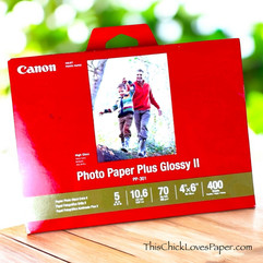
• Canon Photo Paper Plus Glossy II (4×6, PP-301) → For 4x6 or smaller - printed photos
• Canon Matte Photo Paper (MP-101, 8.5×11) → Used for Cricut print-then-cut elements & titles
• Canon Double-Sided Matte Photo Paper (MP-101D, 8.5×11) → Also used exclusively for Cricut embellishments, icons, & layered pieces

Printers - Embellishment & Photo
• Canon TS9521C Crafting Printer — used for printed journaling pieces, print-then-cut embellishments & titles
• Epson PictureMate PM-400 Wireless Compact Color Photo Printer, white — compact wireless printer makes it easy to print beautiful 4" X 6" And 5" X 7" Photos that will last
printer ink refills
How This Friends & Family Wedding Scrapbook Layout Came Together

Alright, so this is usually the part where I’d be like “grab your trimmer, cut this to this size, and let’s go step-by-step…” but since we’re working from a Creative Design Team sketch, we’re keeping those measurements under wraps out of respect for the designers. 💛
BUT… don’t worry. You know I’m not leaving you hanging like that. I’m still walking you through exactly how this came together—the thought process, the placement, and all the little details that make this layout work—so you can recreate the same look.
✂️ Step 1: Building the Base

So I started with the base of the layout, and for this part, I actually stayed pretty true to the sketch. Sometimes I like to go rogue (you’ve seen my scene builds 😂), but this sketch already had such a strong foundation that it just made sense to follow it.
I used the Nature’s Walk DSP as my main patterned paper, and right away, I could tell this was going to be one of those layouts where the photos really get to shine. The base isn’t trying to compete—it’s just there doing its job, holding everything together and letting the story take center stage.
And honestly? That’s kind of the whole vibe of this page.
✂️ Step 2: Those Horizontal Strips (aka where things get interesting)

Now let’s talk about those strips for a second… because this is where I started making it mine 😏
The sketch called for thinner strips, but I wasn’t loving how subtle that felt—especially with vellum in the mix. Vellum is beautiful, but let’s be real… she’s shy 😂 So I made my strips a little bigger so they would actually show up and do something.
And instead of leaving the ends straight, I ducktailed them using the Meant to Be octagon shaped dies (because scissors and I have an understanding—we don’t rely on each other for precision 😂).
That one little change added so much more movement and interest across the page, and it ties back perfectly to the octagon shaped journaling later on.
✂️ Step 3: Matting the Photos
I double-matted the photos using Early Espresso and Basic White, and this is one of those steps I rarely skip. It gives your photos that clean separation from the background, so they don’t just blend into all the beautiful patterned paper.
But more than that… this was about control.

When you’re working with wedding photos, you’ve got a little bit of everything going on—different outfits, tones, textures, backgrounds… it can get visually busy really fast.
So instead of trying to match anything specific, I used Early Espresso as a grounding neutral. It softens everything, adds contrast without being harsh, and gives the entire layout a more polished, elegant feel.
White alone would’ve worked… but the double mat?
👉 That’s what makes it feel finished.
👉 That’s what keeps it from falling flat.
And honestly, it just felt right for this page—which, let’s be real, is sometimes the best design rule there is 😂
✂️ Step 4: Florals, Sprigs & a Little Bit of “Why Did I Do This to Myself” 😂

Okay… embellishments.
You already know I love a good floral moment 🌸
I used my Close To My Heart Secret Garden dies for the flowers, cutting them from Basic White cardstock to keep everything crisp and wedding-soft. I didn’t want the florals competing with the patterned paper, so white felt clean, timeless, and elegant.
For the greenery, I paired the Poinsettia Petals sprigs along with Mossy Meadow leaves and a few vellum leaf accents to soften everything up.
That mix of solid Mossy Meadow and translucent vellum is what keeps the clusters from feeling heavy. The green grounds them… the vellum lightens them.

And then… because apparently I like to keep myself busy for no reason…
👉 I added antique pearls to every single Poinsettia Petals sprig dot. Yes... Every. Single. One. 😂
But listen—it was worth it. It gives this layout that soft wedding bouquet vibe with just enough sparkle to feel special without going over the top.
Now, even though the Antique Pearls already have adhesive on the back, I added a tiny dot of Barely Art precision glue underneath each one for extra security.
Since this album is being gifted and mailed, I didn’t want to take any chances. When something is traveling through the mail, I like knowing those little details are locked in place. ✨

Finally, I added foam tape underneath the flower petals and tucked some under the leaves as well. That little bit of lift makes a huge difference.
It helps the petals keep their shape, adds dimension, and gives the clusters that layered, real-bouquet feel instead of looking flat against the page.
Because when you’re working with wedding layouts…
✨ dimension matters
✨ softness matters
✨ and layering makes all the difference
✂️ Step 5: That Journaling Piece (aka the star of the right page)

Now let’s talk about that hexagon for a second… because she earned her spotlight.
I printed my journaling on a clear Avery label, layered it onto Basic White cardstock, and then ran it through with the Meant to Be octagon die to get that clean, polished shape.
And here’s a little real-life moment for you… 👉 I totally forgot to ink the edges before I glued it down 😂
Would it have looked even better with that extra detail? Yes. Did it still turn out beautiful? Also yes. So if you remember—ink it.
If you don’t—welcome to the club, it still works 😏

Now, let’s talk about why I love these Avery labels for journaling.
There’s definitely a time and place for handwritten journaling—especially when you want that personal, emotional touch. But for layouts like this, where the design is clean and structured, I love being able to type everything out, play with the spacing, and make sure it fits the shape perfectly before committing.
And honestly? That little hexagon ended up saying exactly what this whole page was about… which makes it feel even more special 💛
(*As an Amazon Associate, I earn from qualifying purchases.)
✂️ Step 6: Creating the Title (aka the moment it all comes together 😏)

Now let’s talk about the title… because this is where everything really starts to feel finished.
I cut the words using my Cricut (she earns her keep around here 😏) and used the Natural Hues specialty paper for the letters. That soft texture adds interest without pulling attention away from the photos. For the base layer, I used Early Espresso to ground everything and tie it back into the rest of the layout.
And of course… 👉 I stacked the letters.

You already know I love a stacked title moment. It adds just enough dimension to help the words stand out while still letting the photos lead the story. I adhered the stacked letters with fine-tip precision glue to keep those tiny edges clean and crisp.
Placement-wise, I kept it simple and strong so it anchors both pages without competing for attention.
Because when the photos are this meaningful, the title doesn’t need to shout. It just needs to support. And that’s exactly what this one does. 💛
💛 And Just Like That… The Story Came Together

Once everything was in place, I stepped back and had one of those moments where you just know…
👉 This layout did exactly what it was supposed to do.
What I love most? I used the same paper collection, the same dies, the same florals, even the same color palette I’ve been working with throughout this album—and yet this page feels completely different.
Because it’s not the products that change the story.
It’s the photos.
It’s the placement.
It’s the intention behind it.
This layout isn’t overly busy, it’s not trying too hard—it simply lets the photos lead while everything else supports the story.
And honestly? For a page all about friends and family…
That balance is everything. 💛
✨ One Sketch… Endless Possibilities (and we’re proving it 😏)

This layout is part of our ongoing Creative Design Team Sketchbook Collab, and let me just say…
👉 This group does not miss.
We’ve been working our way through Volume 5 together, and every time a new page comes up, it turns into this creative free-for-all in the best way possible.
Same sketch.
Same starting point.
Completely different outcomes.
And somehow… every single one works.

It’s one of those things where you think you know what you’re going to do… and then you see everyone else’s version, and suddenly you’re like—
👉 “Well, now I need to try THAT too.” 😂
That’s the magic of working with a sketch like this.
It gives you structure… but still leaves plenty of room to make it your own. .. And doing it alongside a group like this? Even better!
If you haven’t grabbed Volume 5 yet, I’m telling you now—it’s worth it. Not just for the sketches, but for the way it pushes your creativity in directions you wouldn’t have gone on your own.
And if you want to see how the rest of the crew tackled this same layout… 👇 go take a peek.
Because I promise—there’s at least one design over there that’s going to make you stop and go, 👉 “Okay, wait… that is GENIUS.”
✂️✨ Crafty People, Good Vibes & A Whole Lot of “Wait… That’s Brilliant”

If this collab has you feeling inspired, then you can probably see why we love doing this together.
This isn’t just about making pretty pages—it’s about crafting alongside people who understand the excitement, the ideas, and the “wait… I need to try that!” moments.
We cheer each other on, swap ideas like candy, and somehow always end up better just from being in the same creative space.
So whether you’re just getting started or you’ve been crafting forever… 💛 You’ve got a seat at the table here.
Obsessed Yet? Wait Until You See These 😍✂️
If this layout has you feeling inspired, don’t stop here.
Because around here? We don’t just do one style.
From weddings to Disney, from bold scene builds to clean layered designs… there’s always something new waiting to spark your creativity.
So if you’re in the mood to explore, scroll a little. Click a little. Wander a little.
You never know which project is going to be the one that makes you say—
👉 “Okay, wait… I need to try that.”


Your Turn… Show Me What You’ve Got! 💛✂️

If you recreate this layout—or even just take inspiration from it—I would LOVE to see what you make.
Seriously… this is one of my favorite parts of this whole crafty journey. There’s nothing better than seeing how you take an idea, make it your own, and bring your own story into it.
So don’t be shy… share it, post it!
Because whether your style is clean and simple, full-on scene builder, or somewhere in between…
👉 your story deserves to be told too 💛
Because These Are the Moments That Matter Most 💛

At the end of the day, this layout isn’t just about paper, dies, or even the design itself…
It’s about the people.
The ones who showed up, stood beside you, laughed with you, supported you, and made the day everything it was meant to be.
The ones who turned a moment into a memory you’ll carry forever.
And that’s what makes pages like this so special.
Not how perfect they are…
Not how detailed they are…
But how they make you feel when you look back at them.
So whether you’re documenting a wedding, a celebration, or just a random Tuesday with the people you love…
✨ tell the story
✨ keep the photos
✨ and don’t overthink it
Because one day, these are going to be the moments you’re so glad you saved 💛
April - This Chick Loves Paper
🛒 Grab Your Supplies & Get Crafting!

All photos and projects are subject to copyright © ThisChickLovesPaper.com.
Images © Stampin’ Up!® & CTMH®.
The content in this blog is the sole responsibility of April Raine – This Chick Loves Paper, Independent Stampin’ Up!® Demonstrator.
The use of and content of classes, services, or products offered is not endorsed by Stampin’ Up!®.
Create a 12×12 double-page wedding scrapbook layout featuring friends & family moments with this step-by-step tutorial. Designed to showcase multiple photos using Stampin’ Up!® Nature’s Walk DSP, created by ThisChickLovesPaper.com for the Jayma Malme & Creative Design Team Sketchbook V5 Page 12 collab. ✂️✨

⭐How I Protect My DSP, Cardstock & Finished Cards
*As an Amazon Associate, I earn from qualifying purchases.
I store my DSP, cardstock, scraps, and even finished cards in these clear resealable bags.
The 2-mil thickness is perfect for everyday crafting (they make a 4-mil option if you want extra durability!), and they’re tough, reusable, and great for keeping your entire crafting stash clean, tidy, and protected from the chaos of the craft room.
• 13×13 Plymor 2mil Zipper Reclosable Bags — for 12×12 DSP, cardstock sheets & scraps
• 9×12 Plymor 2mil Zipper Reclosable Bags — for 8.5×11 cardstock & scraps
• 6x8 Plymor 4mil Heavy Duty Reclosable Bags — for storing extra die cut embellishments & finished cards, card workshop kits


Comments