💫 Believe in the Magic – 8 Design Tips for Taming Bold Paper in a Clean Christmas Scrapbook Layout 💫
- This Chick Loves Paper

- Sep 30, 2025
- 10 min read

Believe in the magic… and the power of bold paper.
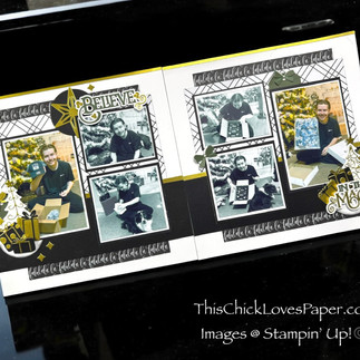
This 12x12 double-page layout is living proof that high-contrast patterns, black-and-white drama, and brushed gold accents can totally work—without overpowering your photos. I used Stampin’ Up!’s Modern Christmas DSP, which is anything but subtle. But instead of letting the bold prints boss me around, I built a layout that feels clean, cohesive, and unapologetically festive.
If you’ve ever stared at a loud pattern and thought, “I love this… but how the heck do I use it?”—this post is your holiday miracle. I’m sharing 8 design strategies that helped me tame the boldness, use foil with finesse, and let my photos take center stage. This isn’t a step-by-step post—it’s a confidence-building design deep dive to help you master layout decisions that work with your stash instead of against it.
Whether you’re new to bold paper or want to elevate your layering game, these tips will help you create a page that shines without the chaos. So grab your peppermint mocha, fire up the trimmer, and let’s make layout magic together. 💫
📦 Materials Used For This Christmas Scrapbook Layout 💫


🖨️ Designer Series Paper:
• Stampin’ Up! Modern Christmas DSP
• Stampin’ Up! Brushed Gold Specialty Paper
(¼” and ½” borders across top and center, plus foil accents on embellishments)
🖼️ Cardstock:


• Stampin’ Up! White Willow Cardstock – base, photo mats, and gifts
• Stampin’ Up! Basic Black Cardstock – photo mats and embellishments
• CTMH Pine Two-Tone Cardstock – title tag elements
🎄 Dies, Stamps & Bundles:


• Stampin’ Up! Deckled Circle Dies
• Stampin’ Up! Decorative Tree Bundle – including tree overlays & gift wrap detailing
• Stampin’ Up! Ornamental Christmas Bundle
• CTMH Home for Christmas Stamp + Thin Cuts
🔧 Tools & Adhesives:


• Multi-Purpose Glue / Bearly Art - Precision Craft Glue
📸 Layout Format:
• Double-page 12x12 layout
• 6 photos total (4 black & white, 2 in color)
• Flip flaps used to include hidden journaling + extra color photos
💬 P.S. New here?
✨ If this is your first time reading one of my blog posts… welcome! Normally, I walk you through a full step-by-step tutorial with measurements, techniques, and product pairings.
Today’s post is a little different. Instead of giving you glue-by-glue instructions, I’m diving into the design strategies that made this layout feel polished and purposeful, even with bold paper, foil, and flip flaps in the mix.
Let’s talk design decisions… and how they’ll boost your crafting confidence.
8 Design Tips for Taming Bold Paper for a Clean Christmas Scrapbook Layout

You don’t need to be using Modern Christmas to make these tips work, but if you are, welcome to the gold foil party. 🥂
Whether you’re scrapping with Stampin’ Up!’s latest holiday release or digging deep into your stash, these 8 design strategies will help you tame bold patterns, balance your layout, and let your photos on your Christmas scrapbook layout shine! I’m walking you through the exact choices I made for this black, white, and gold double-pager—and showing you how to apply them with any DSP you’ve got.
Let’s turn that loud paper into layout magic. ✨
🧠 Tip #1: Use Bold DSP Like a Spice, Not the Main Dish

What I did:
I used Stampin’ Up!’s Modern Christmas DSP in small strips and panels instead of full-page coverage. Just enough to show off the pattern without letting it take over. The base of each page is White Willow cardstock, layered with Basic Black strips and mats to give the design structure and balance.
Why it works:
Bold or busy patterned paper (especially holiday designs) can feel overwhelming when it covers too much space. Without something solid to ground it, your photos and embellishments can get lost in the noise.
How YOU can do this (even with different paper):
If you’re working with strong DSP (think stripes, grids, large icons, or high contrast), try this:
• Use solid cardstock for the base (white, kraft, black, or a soft tone pulled from the DSP)
• Cut your DSP into ¼” to 2” strips, banners, or rectangles to layer over your solids
• Keep those DSP strips toward the edges, middle, or photo mats—not across the entire background
• If your pattern has a direction (like words or trees), make sure your strips follow the same orientation for flow
Pro Tip: You don’t have to skip the bold paper—just shrink it down! A little pattern in the right spot makes a huge impact without overwhelming your layout.
April – This Chick Loves Paper
🪞 Tip #2: Anchor Your Layout with Symmetry
What I did:
This layout has a strong visual balance—photos are mirrored side to side, embellishments are clustered in diagonals, and the title sits in the middle like a spotlight.

Why it works:
Symmetry is your best friend when working with bold paper. It tricks the eye into thinking the layout is “cleaner” than it really is because the structure feels intentional. It’s like putting together a loud outfit, but then adding a blazer to make it fashionable. 💅
How YOU can do this (even with different photos):
• Use mirrored photo placement on both pages (left photo → right photo)
• Cluster embellishments in a diagonal line from top left to bottom right (or vice versa)
• Center your title or journaling in a way that feels like a focal point
Pro Tip: If you’re ever unsure where to place something—ask: “Does this balance something on the other side of the layout?” If yes, go for it!
🎨 Tip #3: Solid Shapes & a Simple Color Scheme Are Game-Changers

What I did:
To balance the bold Modern Christmas DSP, I kept my embellishments solid and simple—trees, tags, gifts, bows, and stars in black, white, gold, and green. No patterns. No chaos. Just clean cuts with consistent tones.
Why it works:
When your paper is loud, your embellishments need to whisper. 😉 Using solid cardstock shapes instead of more patterns gives your eye a place to rest. It also keeps the focus on the photos and makes the layout feel intentional instead of overloaded.
How YOU can do this (no matter your stash):
• Choose 2–4 colors that either match your DSP or contrast softly (black/white/gold is always safe)
• Die cut your shapes from solid cardstock or foil—no busy patterns
• Repeat those same shapes across the page for a cohesive, designer-quality look
• Avoid adding stamped sentiments or tiny text directly on the busy parts—keep the words in the journaling
Pro Tip: If your DSP has red, green, and gold—choose ONE of those for your embellishments, not all three. Less is more. Always.
🎁 Tip #4: Repeat Embellishments (It’s Budget-Friendly AND Brilliant)
What I did:
I used a small handful of shapes—trees, bows, gifts, and stars—and repeated them across both pages. These elements were made using Stampin’ Up! and CTMH dies, cut in white, black, gold, and pine cardstock. Each corner of the layout features a mini “cluster” built from the same shapes in different combinations.

Why it works:
Repetition helps the layout feel cohesive and guides the viewer’s eye. It keeps things organized without looking boring. PLUS—if you’re crafting with a smaller stash or fewer tools, reusing what you have is everything.
How YOU can do this (even without the same dies):
Pick 3–4 small shapes (such as stars, hearts, leaves, trees, tags, or any other shapes that fit your layout theme). Use:
• The same shape in different sizes
• Multiple cuts of the same die in different papers
• The same colors repeated in different combinations
Then, place clusters in opposite corners or diagonally across your layout. Repeating shapes doesn’t have to mean copy/paste—it’s about consistency with variety.
Pro Tip: If you only own one tree die, cut it three times in different papers. Add a star or circle underneath to anchor it. Boom—cohesive cluster!
🌟 Tip #5: Don’t Just Add Foil—Weave It In

What I did:
I used Brushed Gold Specialty Paper in thin strips (¼” and ½”) to create borders across the layout. Then I carried that same gold foil into my embellishments—stars, gift wrap, tree layers, even small accents. The Decorative Tree Dies helped me cut delicate foil overlays that became pattern paper for the gifts!
Why it works:
Foil is festive. It’s sparkling. It’s the holiday magic in paper form. But let’s be real, it can turn chaotic fast. I chose Brushed Gold because it brings that elegant shine without trying to outshine the DSP. Unlike glimmer paper, which would’ve fought for attention, this foil plays well with others. The trick? Repetition and restraint. By weaving foil in multiple spots and keeping it light, it becomes part of the design, not just a loud guest at the party.
How YOU can do this (even with a different foil):
• Cut foil into narrow border strips and layer them with cardstock or DSP
• Use foil paper for details—gift wrap, ornament tops, star accents, word shadows
• Repeat foil at least 3 times on the page: top, middle, and embellishment clusters
Pro Tip: Foil is like jewelry—don’t throw it everywhere. Place it where the light hits: corners, titles, or layering behind important elements.
🖤 Tip #6: Use Black & White Photos to Calm the Chaos


What I did:
I printed four of my six photos in black and white to calm the layout down visually. Then I used flip flaps to tuck the full-color photos underneath, along with my journaling.
Why it works:
Bold layouts can make full-color photos feel too much. By switching to black and white, your photos become part of the design. They highlight faces and emotion without clashing with your patterns or embellishments.
How YOU can do this:
• If your photo has a lot of red/green/blue (and your layout doesn’t), print it in black and white
• Use flip flaps (or even washi tape hinges!) to add the color photo behind the black-and-white one
• Do the same with journaling: hide it underneath or behind clusters for a cleaner layout
Pro Tip: Flip flaps are perfect when you want it all—style up front, story tucked underneath. Best of both worlds.
📦 Tip #7: Flip Flaps = Hidden Storytelling Superpower
What I did:
I used flip flaps to hide both full-color versions of my photos and as journaling under the black-and-white photos. That way, the layout stayed clean and minimal up top, while still packing in all the memories.

Why it works:
Flip flaps let you have your cake and scrapbook it, too. 🧁 If you’re working with a limited space, busy paper, or just want a cleaner layout, they give you a clever way to include:
• More photos (especially if some are “almost duplicates”)
• Color versions of black-and-white edits
• Journaling strips, cards, or even memorabilia
How YOU can do this
• Use flip flaps (Stampin’ Up! makes them) or DIY your own with washi tape or clear sticker hinges
• Print multiple photos: one in B&W for the front, one in color for underneath
• Add journaling underneath the flap using pre-cut strips, a typewriter font, or a mini card
Pro Tip: Want to get fancy? Use a tab punch or a small embellishment to act as a “handle” for lifting the flap—it makes it interactive AND adorable!
✂️ Tip #8: Let Your Title Do the Heavy Lifting
What I did:

I created a custom title using my Cricut “Believe in the Magic”, sized and styled to match the exact space I had. That one phrase does so much of the storytelling, I didn’t need to add more text all over the layout.
Why it works:
Your title is a powerful tool in layout design. When it’s custom-cut, intentionally placed, and layered over a clean area of the page, it becomes both the theme and the decoration. It can also help fill space and tie your color palette together.
How YOU can do this (with or without a Cricut):
• Use your Cricut, dies, or even stickers to cut a title that matches your layout’s message
• Size it to fit your empty space—not too small that it disappears, not too big that it fights your photos
• Layer it with a shadow layer, tag, or circle to give it a strong foundation
• Keep it short but meaningful (2–4 words max is ideal)
Pro Tip: Match the cardstock used in your title to one of your embellishment layers to keep the design tight and cohesive.
🎬 Magical Finishes & Final Thoughts

You’ve now got 8 power-packed tips for turning bold paper into balanced, beautiful layouts. ✨ No step-by-step needed—just a sprinkle of strategy, a splash of sparkle, and a whole lot of creative confidence.
Whether you’re tackling your first bold pattern or you’ve got a stash full of foiled flair waiting to shine, this layout proves that less chaos = more magic. ✂️🖤
🌟 Explore More: Gold, Glimmer, and Grown-Up For Any Occasion!


Ready for more holiday sparkle? ✨
If you love layouts with shimmer and shine, don’t miss my other projects using specialty paper like:
You’ll see how these luxe layers can elevate your albums, whether you’re scrapping a black-tie dinner, a cocoa-sipping pajama night, or anything in between.
Or maybe you’re just here for the Christmas layouts? 👀
From rustic reds to ultra-modern monochrome, I’ve got layouts to match every festive vibe.


📸 Share Your Sparkle — We Want to See Your Magic!

Have you tried using bold DSP in a new way? Did you tame your paper stash with one of these tips? Or maybe you made your own twist on this very layout?
🖼️ Drop it in the Members Gallery or tag me on Instagram so I can throw virtual confetti your way! 🎉 Your project might inspire another crafter to believe in their own magic.
Let’s keep the creative circle going—and keep cheering each other on!
💫 Final Thoughts: Bold Doesn’t Mean Busy

The truth is: bold paper gets a bad rap. But it’s not too much. It just needs the right co-stars.
This layout reminded me that clean design doesn’t mean boring—it means thoughtful. Strategic. Balanced. And above all? It means your photos shine without the background stealing the spotlight.
Believe in the magic of layering. Of repetition. Of solid embellishments.
But most of all—believe in your ability to create a layout you love.
I’ll see you in the next post. Until then—cut boldly and craft beautifully. 💛
🛒 Grab Your Supplies & Get Crafting!
All photos and projects are subject to copyright © ThisChickLovesPaper.com.
Images © Stampin’ Up!®
The content in this blog is the sole responsibility of April Graziano, Independent Stampin’ Up!® Demonstrator. The use of and content of classes, services, or products offered is not endorsed by Stampin’ Up!®
Create a clean, balanced 12x12 double-page Christmas scrapbook layout using bold patterned paper! Get 8 expert design tips for using bold holiday paper like Stampin’ Up!’s Modern Christmas DSP, flip flaps, and gold foil, plus more inspiration from This Chick Loves Paper for crafting standout seasonal layouts.


Comments